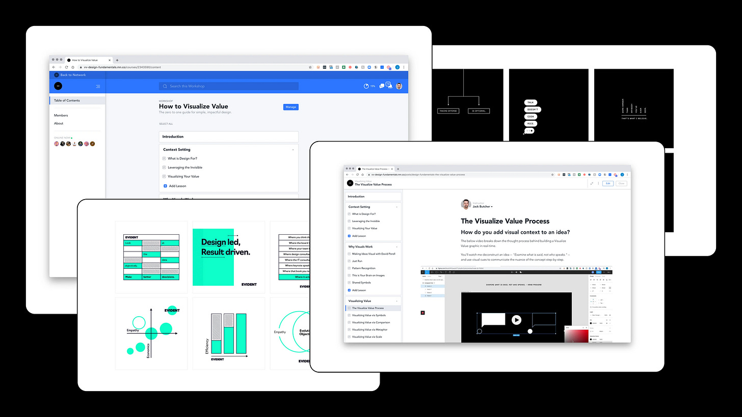
Masterclass: How to Design Like Visualize Value
The 12 visual communication tactics leveraged by Jack Butcher's Visualize Value
Language is the most important technology invented by humans.
Our species dominates the world because we alone are able to communicate with each other at scale, about things both real and imaginary.
But since long before we could read, write, or even talk, we have been relying on visual information to survive.
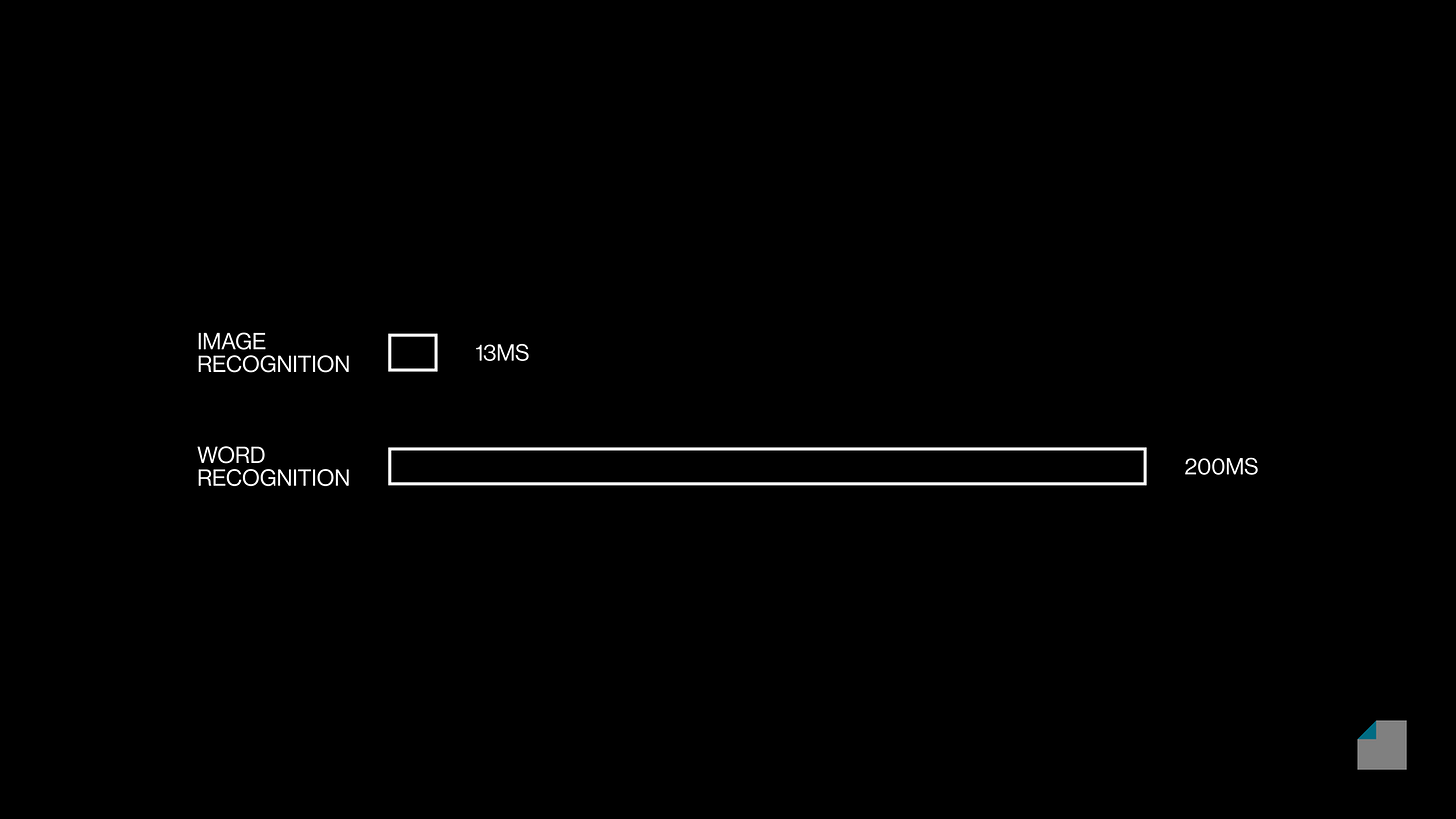
We process images 15x faster than words. But even this radical speed differential understates the power of visual perception: The information content in pictures can be vastly more than words.
This biological fact is the foundation of all design disciplines. Even designers who work with intangibles like sound, strategy, and "experience" must rely on the fundamental skill of visual communication in the process of creating those end results.
Perhaps no other living designer has leveraged visual communication quite like Jack Butcher.
Jack's Visualize Value brand was born from his skill in creating professional presentations. Packaging his craft into bite-sized, shareable posts with a sharp visual style on Twitter and Instagram earned him the attention of millions. Applying design thinking and product development to serve his audience turned millions of eyeballs into millions of dollars. Jack turned visual design in its purest form into a business, community, and institution.
It's no secret that Design Disciplin looks up to Jack and Visualize Value. Both our vision and tactics are informed by his work and teachings. It's about time we turned our attention to how Visualize Value's designs are made.
What follows is a set of 12 visual communication devices that Jack uses to create his acclaimed visuals.
For designers of all walks, these are fundamental building blocks that we must not only recognize but master. For non-designers, they are powerful tools that will boost your reports, presentations, and marketing ahead of the pack.
This content comes straight out of Jack's inaugural online course: How to Visualize Value. I took the course when it came out, and even as an experienced designer, I found clarity and tools that helped me with visual creation and teaching. You can expect all of the below, and much more.
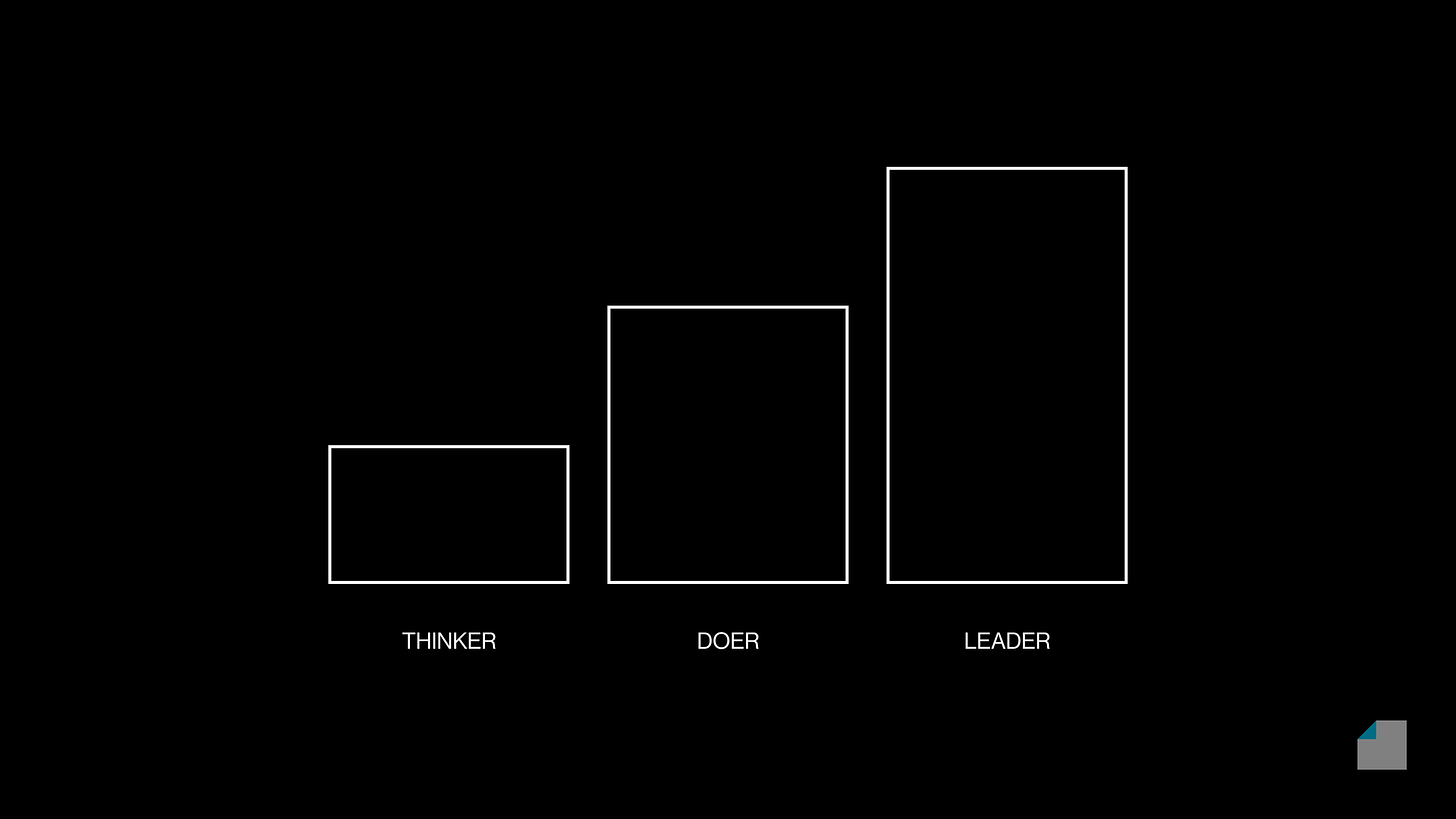
Scale
When we see objects that differ in size, we intuitively understand how they relate to each other in terms of volume and mass.
Beyond physics, in the conceptual world, visual scale also communicates quantity, order, significance, respect, and much more.
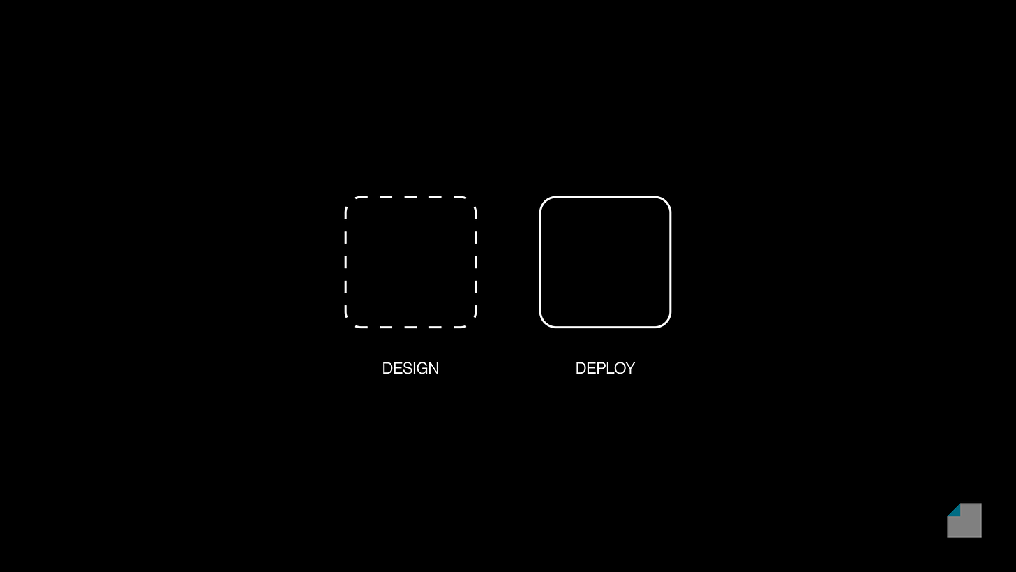
Comparison
Viewing two objects side by side invokes a sense of comparison, highlighting both similarities and differences between the two.
This simple but powerful effect, technically called juxtaposition, has been employed to great effect by philosophers, architects, orators, artists, and filmmakers across the board.
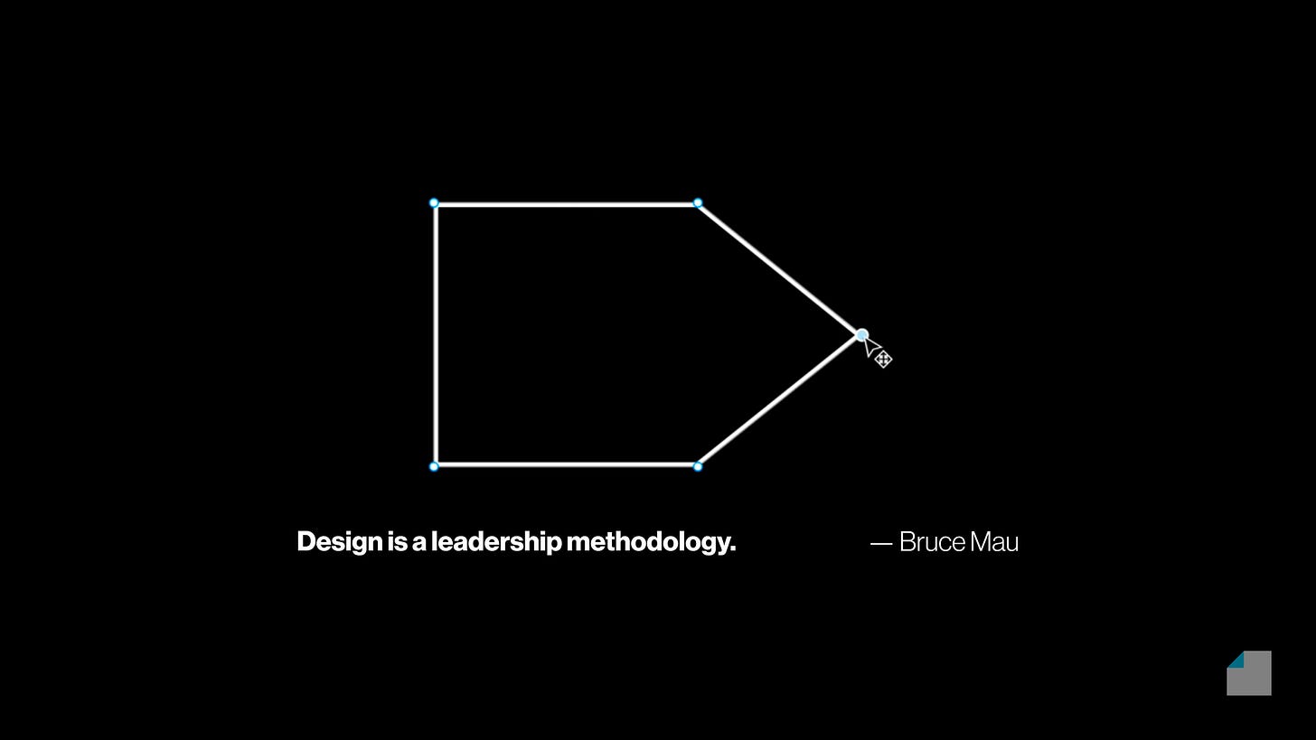
Metaphor
Long before we could even talk, we used signs and symbols to express ourselves. The discipline of semiotics, where we study this subject, is perhaps the most expansive among all of the intersections between design, science, and philosophy.
The key to visual design is knowing which symbols to use and which to avoid. Here, there are no shortcuts, because our culture and symbols evolve perpetually. The only way to acquire mastery over symbols is to be a lifelong student of visual culture.
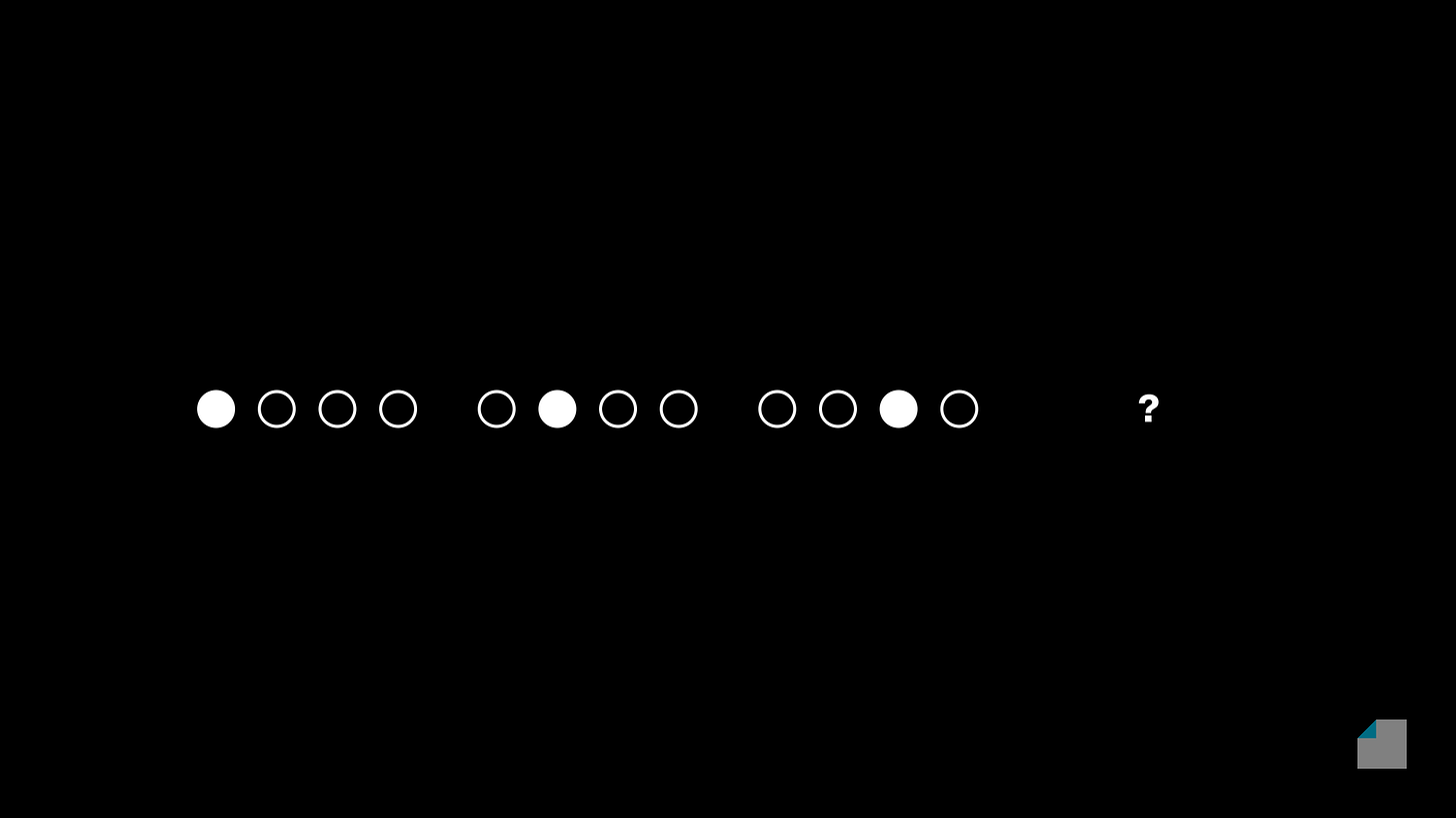
Pattern Recognition
Pattern recognition is the key to the human mind, to the extent that neuroscientists describe brain as a "prediction machine."
In visual design, patterns give us the power to communicate without speaking.
Flow
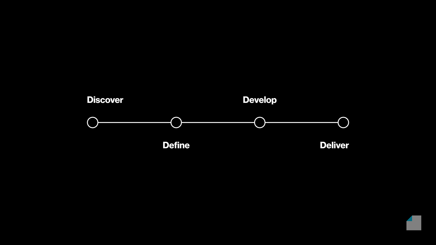
Close your eyes, and picture a "timeline." Chances are, it flows left to right.
With your hand, gesture "there." There's a 90% chance you are right-handed, hence the gesture occurs left to right, outward from your body. Our anatomy informs not only how we act, but also our perception.
Stacking
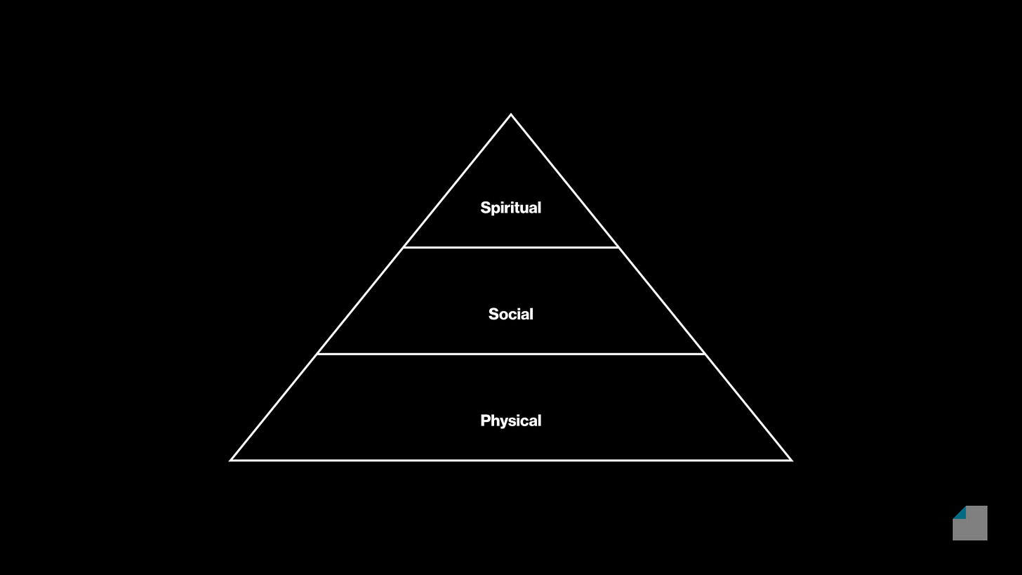
When we build in the physical world, we naturally use supporting structures that are wider and heavier than the load they carry. The peaks of these structures are naturally less spacious, and more challenging to reach than the lower levels.
As a visual device, stacking communicates hierarchy, challenge, movement, and sequence: To reach the peak of the structure, it's necessary to climb through the steps in order.
Continuum
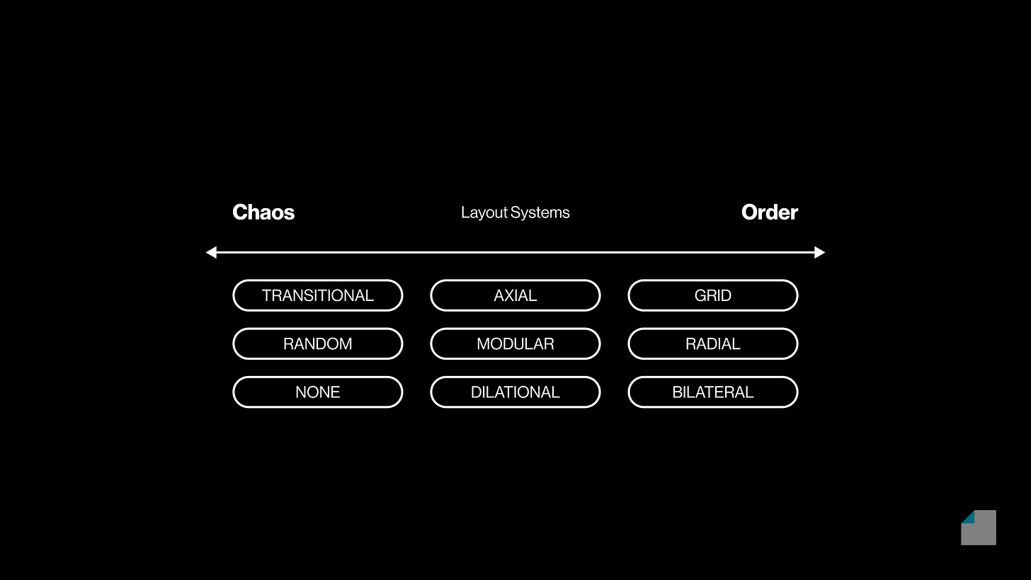
We're naturally inclined to think in terms of dichotomies: light vs. dark, liberal vs. conservative, good vs. evil... It's easy to make sense of the world this way.
Continua help us visualize and appreciate the shades of gray between black and white. This visualization is useful to compare more than two things, based on a single attribute.
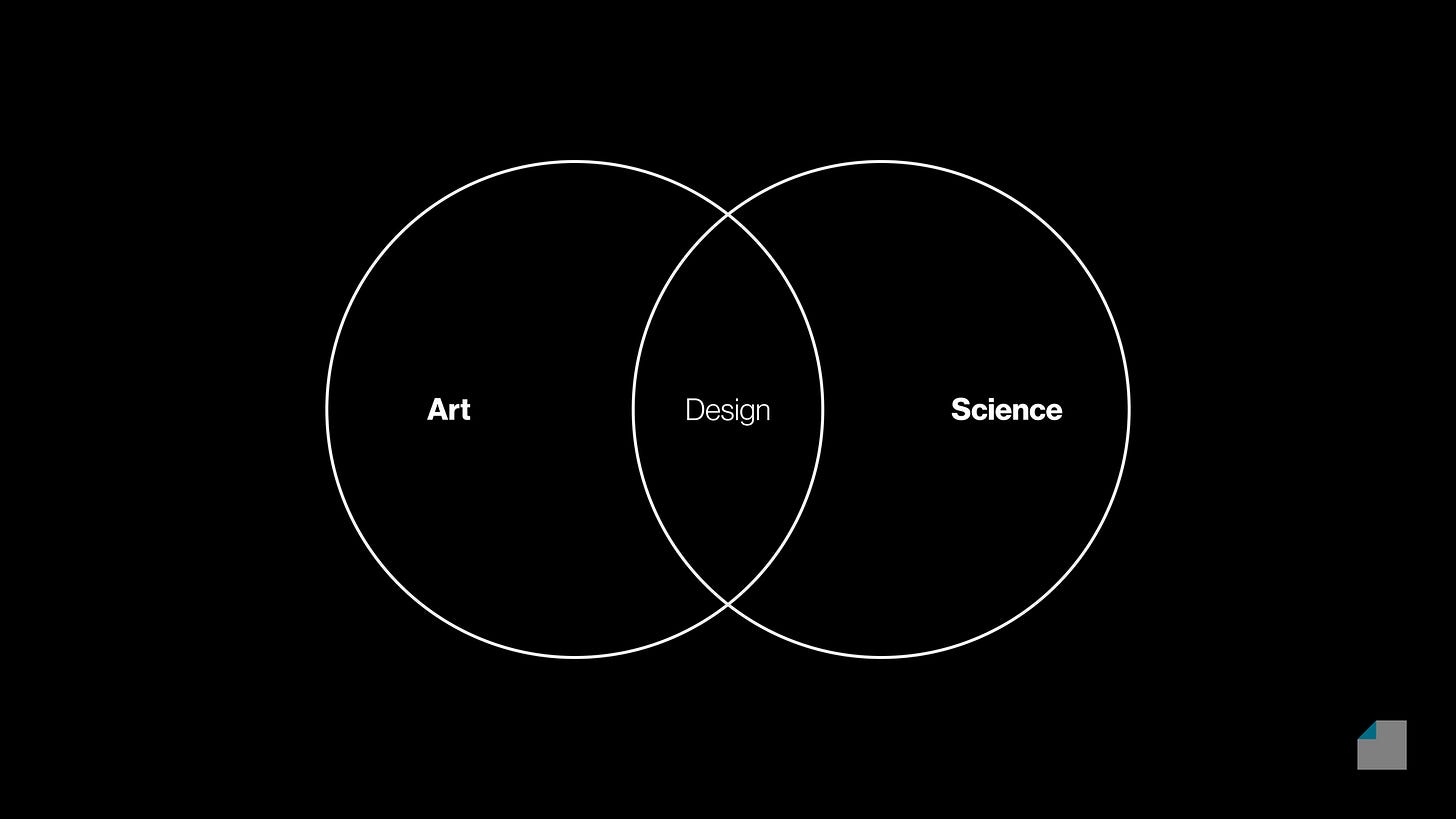
Venn Diagram
The Venn diagram is an indispensable tool of mathematics and logic. We all learn them as kids in school, to visualize intersections and differences of different categories.
As a symbol, the Venn diagram relates to the fundamentals of our social life: belonging, sharing, and coming together, but also exclusivity or standing out.
Hierarchy
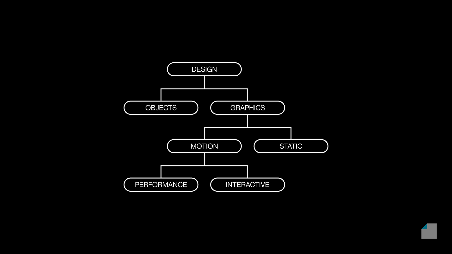
The classic organizational chart is best known for helping us manage companies.
But hierarchies and cascades are a natural part of our world – family trees help us appreciate origins, lineage, and distinctions for all kinds of ideas and artifacts.
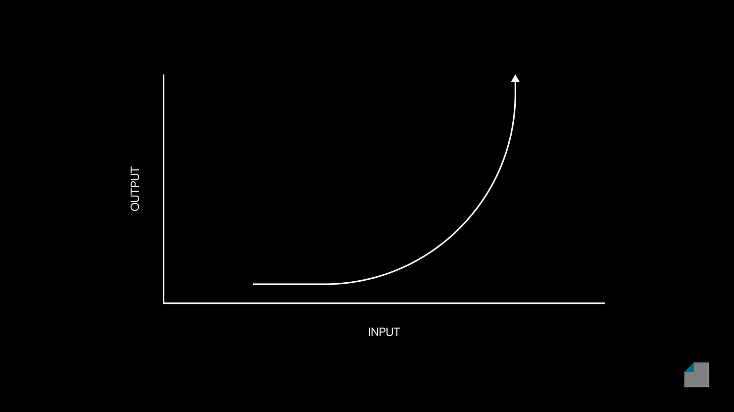
Cartesian Plot
"How does Y change when X changes?" This is the essential question of all science in our modern world.
The Cartesian coordinate system allows us to see relationships beyond the intuitive, to truly make sense of input-output relationships, and make purposeful decisions.
Loop
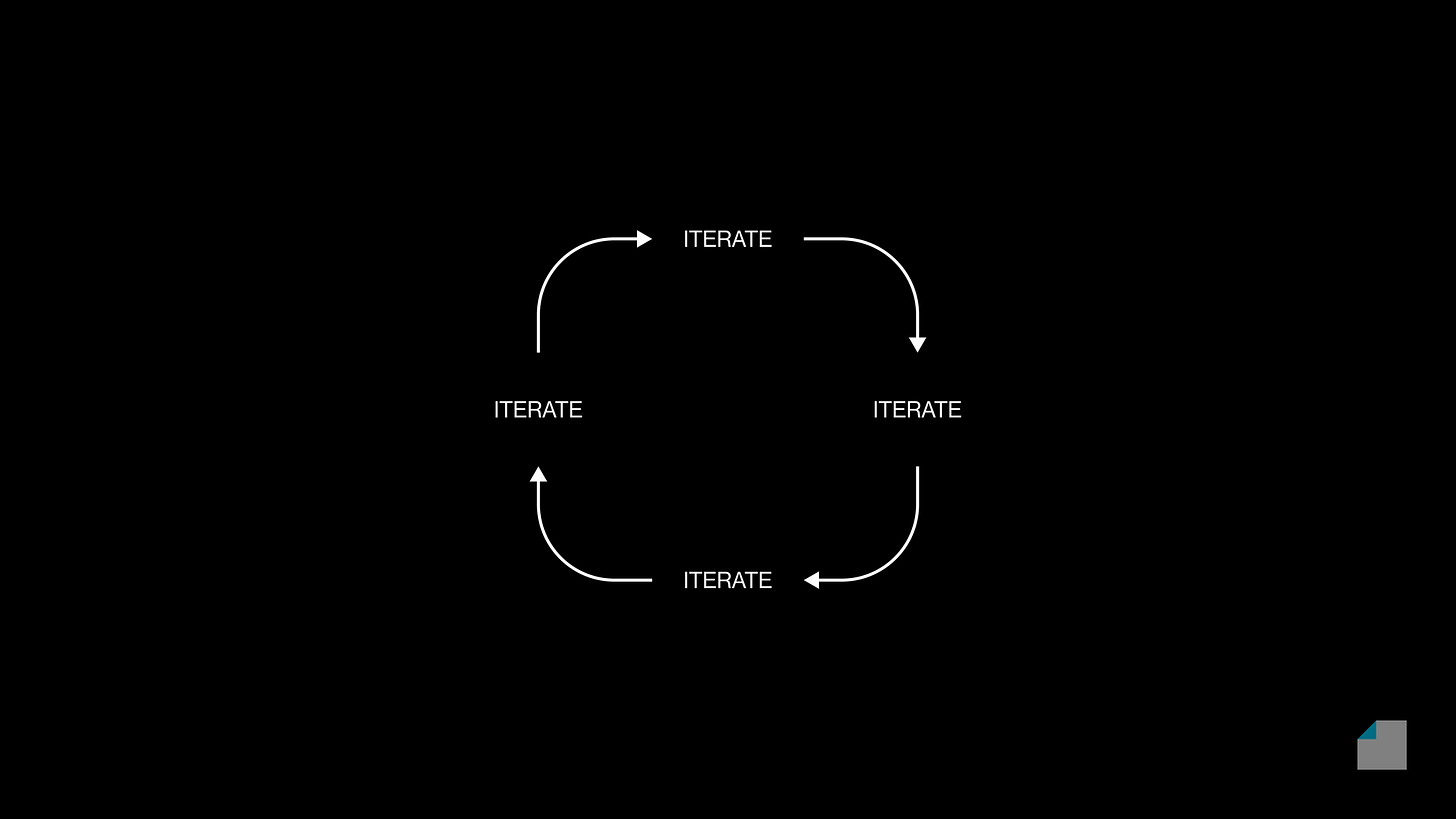
Linear stories are easy to understand, but life is seldom so simple.
In nature as well as human ventures, things move in cycles and feedback loops. What goes around, comes around.
Spectra
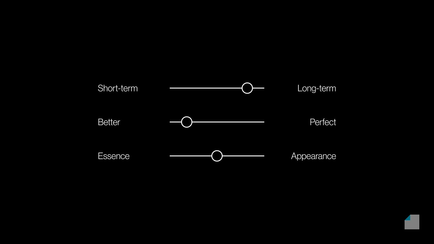
Multiple attributes plotted together in a continuum helps us break down and compare complex things.
Seeing things in black and white is easy, but nature is full of many colors. The spectral visualization is useful for seeing nuance, comparing ideas along multiple dimensions.
How to Visualize Value
How to Visualize Value teaches you how to turn your ideas into high-impact, unforgettable visuals that cut through the noise of the newsfeed.
Suitable to take you from zero to one in design, or learn how to better articulate value as an already accomplished designer.


